
The watercolour at the top of this page is untitled and is widely regarded to be Kandinsky’s first ever abstract piece. Many pieces before this, however, appear to be abstract. The difference is that the earlier paintings were abstracted – they were actually of a physical thing – whereas this one is purely abstract. As Kandinsky’s early style developed he appears to get progressively more experimental with his use of colour – specifically vibrant colours he didn’t seem to use in the early years of blacks and browns. His colours are applied in thick chunks, working with and around each other rather than constantly blending. I think that this was where he began to use the more abstract idea of applying colours in ways to create a feel or meaning rather than as a part of an obvious scene, landscape or set up – an idea associated with Rothko’s colour fields: it’s about how the colours work together and what they mean to observers. Maybe it’s at this point his pictures become more abstracted because, like when he omitted skies and waters, he’s aiming the focus elsewhere – in this case, giving them more sentimental value.
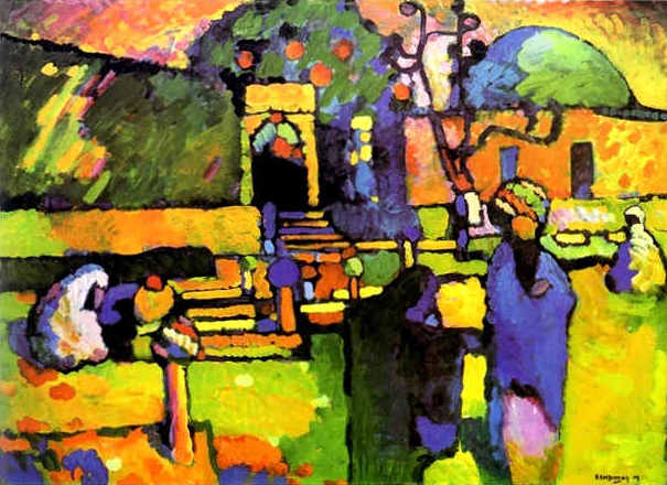 This painting, Arab (Cemetery) from 1909, shows only very subtle uses of the blacks and dark colours that previously dominated whole sections of Kandinsky’s settings. The soft yellow and greens give it a warm feeling that contrasts the harder blues used to describe figures walking through the cemetery. Could Kandinsky be using colours to express his thoughts on the sentimentality associated with cemeteries. It’s very possible that these colours are not too far from the truth of this cemetery but it’s evident they’re completely exaggerated. For me, I think Kandinsky saw a kind of beauty and dignity in the cemetery. Kandinsky famously said many things about colour in conjunction with various other things but I think that this is particularly relevant here:
“Many colors have been described as rough or sticky, others as smooth and uniform, so that one feels inclined to stroke them (e.g., dark ultramarine, chromic oxide green, and rose madder). Equally the distinction between warm and cold colors belongs to this connection. Some colors appear soft (rose madder), others hard (cobalt green, blue-green oxide), so that even fresh from the tube they seem to be dry. The expression “scented colors” is frequently met with.”
 Murnau, Garden, 1909 shows a much more abstracted image. Flowers are recognisable and potentially clouds or some kind of sky in the background but what’s really striking is how rich is it in colour. The blues aren’t negatively cold but rather cool and complimenting of the glowing oranges and yellows and the more earthy greens. This painting appears to me to emphasise the beauty and harmony in nature – it’s so sweet you can almost taste it.
Kandinsky’s relationship with the colours he used certainly says a lot about why he used certain colours on the canvas. Over the next four years Kandinsky’s paintings remained much more abstracted with some being totally abstract titled as ‘Composition n’ or ‘Improvisation x’. It’s clear his focus drifted slightly from associating colours with real life images (although he still did mostly those) but became about playing with colour, shape and position.
 Improvisation 11 is a wonderful example of Kandinsky’s transition period from real life images to almost completely abstract concepts. Some vaguely familiar shapes are identifiable but really this is completely abstract. For me, the colour and shape gives it a kind of domestic feel.
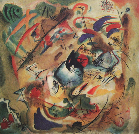 Improvisation, Dreamy 1913, is fairly similar to the watercolour at the top of the page in the way certain colours are grouped, divided and how shapes are arranged with lines and swirls. These become much more prominent and refined in the later years. Many of these were done with watercolours. Perhaps this was because Kandinsky appreciated the lack of control when used with a lot of water. Aspects of this particular piece certainly appear very washed, perhaps meriting it the name ‘Dreamy’.
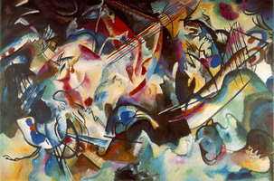 Composition VI 1913 is amongst paintings that for me mark the end of Kandinsky’s first major exploration of what painting and colour meant to him. Very different to previous paintings particularly in the way it introduces the use of refinement to create contrast – some shapes with very sharp edges and some kept fairly obscure.
I feel that my thoughts on Kandinsky’s early explorations with colour are backed up particularly by this one painting, also 1913 and in my opinion marking the end of his first major ‘era’. Colour study: Squares with concentric Circles. It’s fascinating how prominent circles would become in his later works.

