Author Archives: samrichards97

Bryan Wynter vs Roberto Matta

Bryan Wynter is one of my favourite abstract artists because his style is so raw and needs so little form to be so incredibly well structured and coherent. Wynter is one of the St. Ives British painters. He became addicted to mescaline, a powerful hallucinogenic drug, which is believed to have had a huge influence on his paintings. Much of his work was heavily inspired by nature.
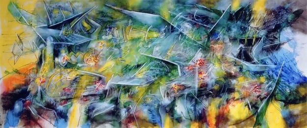
Bryan-Wynter,-Torrid-Zone-Region,-1958

Torrid Zone

The painting above is one of my favourite paintings by Wynter and one of the first paintings I ever saw by him. The stacked nature of the shapes and strokes makes me think of a very diverse meadow with towering grasses. Certainly some of the more defined shapes could even be flowers. However, the painting is clearly more abstract than abstracted, I believe it heavily reflects nature as its main influence but is not necessarily meant to be of aspects of nature. One thing that really draws me to Wynter’s work is how, with so little definition and so much energy and activity, he manages to create a kind of structure to his paintings. The strokes are stacked with shapes and colours often following a pattern that tapers out through the painting or is overcome by another one. I think an interesting take would be to recreate this with buildings. The stacked uniformity of buildings from birds eye few would be interesting to use as an influence for this kind of style. Throughout the chaos he creates on the canvas, Wynter amazingly manages to produce a piece packed with themes, motifs and is amazingly coherent.

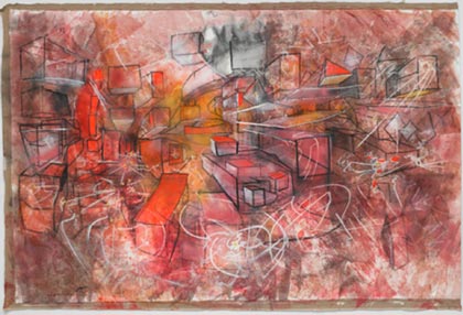
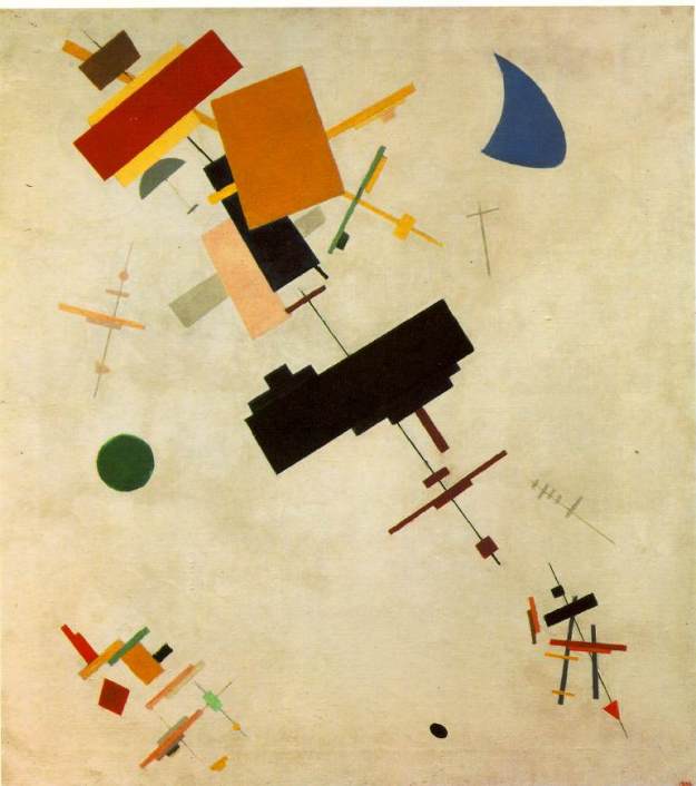
The comparison I’d like to make between Wynter and Matta comes as a result of the fact that Wynter maintains this structure and coherence throughout his chaos. In the painting below, Matta manages to create a kind of structure through his careful placement of lines of white over a beautifully chaotic background.

Sebastian Matta - Archivio Generale Opere

This scribbly style manages to be very different to Wynters while creating a similar effect. As chaotic as the image seems, it feels as though every piece of it was placed there with a purpose and it has a kind of coherence around the placement and integration of the white lines which form some slightly more defined shapes protruding from the background.

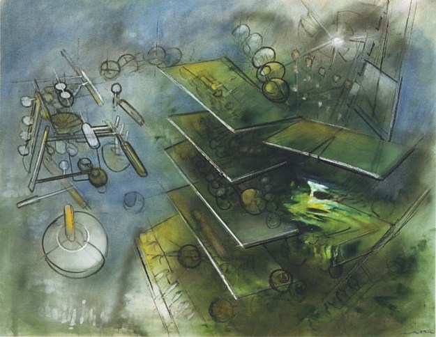
In terms of its colour scheme I find it to be more similar to two other paintings by Wynter:

Mineral World – Left, and Atavistic Group – Right.

Here it is obvious where the two differ quite significantly. While Wynter’s shapes tend to be stacked and arranged over the top of more shapes or textures, Matta’s tend to be drawn out of the less defined background with the introduction of lines and the smoothing or calming of the textures around these guiding lines.

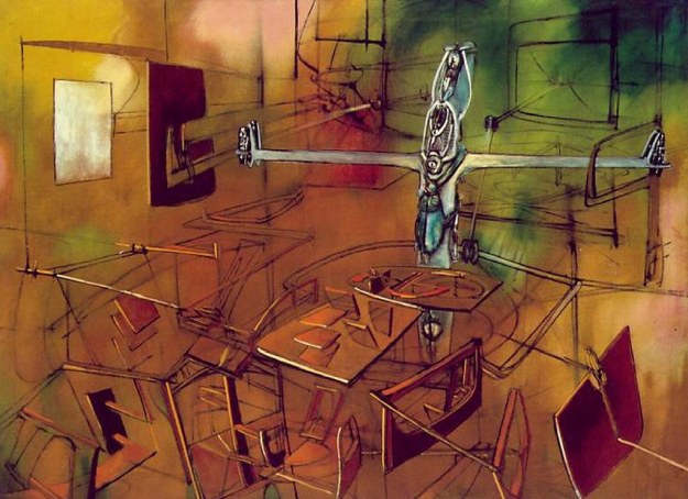
I love how, particularly in Mineral World, the square-ish forms could almost be small buildings or flowers or indeed the intricate and exciting textures on the side of a rock with minerals protruding. Again, despite it’s chaos it almost becomes very uniform. The stacking of shapes is similar to a feature of the painting shown below, by Matta:

claus

This painting is much much less textured than either of the ones shown by Bryan Wynter however it does possess a similar colour scheme and this wonderful idea of order emerging  from chaos or being the product of chaos.

My favourite painting by Bryan Wynter is Seawall, shown below. I love his use of he colours and how he keeps the dark blues very close to blacks. How, again, we see another example of curves being used to create motion. His scarce use of white in the centre and his preference of light blues to actual white when creating a contrast to the darkness creates this beautiful sense of the water flowing. As with most Bryan Wynter paintings, it is his textures which are most intriguing, in this case perfectly representing the glinting of light of the uneven surface of falling water.
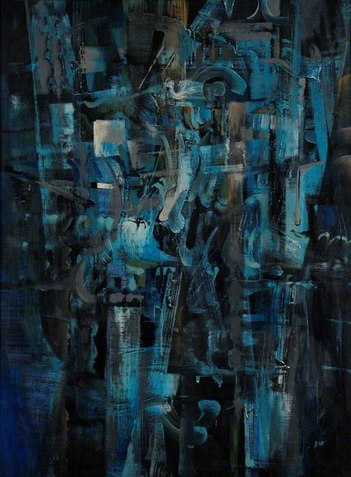
seafall

Seawall

The use of shape and organisation forming or emerging from chaos is an idea I would like to explore in my final piece.

The Mattas

Roberto Matta was an architect turned abstract expressionist and surrealist painter, who’s paintings reflect his studies in architecture through their use of lines and in some cases, actual creation of structure. Interestingly, many show a stark contract to the typical refined work of the architect and, in my opinion, reflect a desire to break free of the conventional constraints of architecture. Roberto Matta is also the father of Gordon Matta-Clark who also studied architecture and is most famous for what he called his Anarchitectural works. It’s interesting how his work, which involved real buildings, also sought to shake off the conventional ideas behind architecture much like his father.

Roberto Matta:

Roberto Matta was heavily influenced by the writings of Freud and in his paintings, sought to display and generate human emotions by perceiving the mind as a three dimensional landscape in which structure and even life could exist. Some of his work would simply depict straight disjointed lines painted over and amidst vibrant uncontrolled displays of colour.

matta-cosmos-mental

Cosmos Mental

The painting shown above is a great example of this. By comparison to some of his other works, this is very monochrome however the bizarre curls and scribbles emerging from the angry shades of reds are typical of many of his works and the smoother refined structures protruding into the foreground is a clear link to his architectural roots. It’s interesting how the goal of paintings such as this was to evoke or represent emotion. The contrast of fixed refined structure and mess/scribbles could very well describe the mind of someone who’s angry. Maybe he is simply trying to represent the mental landscape – a reasonable conclusion given the name. I really like the way he has constructed building like structures over the top of the rough background. This could almost represent the life of a city directly contrasted with the refined structure of a city.

matta

The painting above is an example of one in which he actually introduced a being however unrecognisable it is. I think his architect years come through much more prominently in this image as the being is surrounded by structures constructed using lines that often simply use the colours of the background with the addition of white light of shadow to bring them forward. This is an interesting  technique and one I would quite like to experiment with before doing my final piece.

Gordon Matta-Clark:

Matte-Clarks work is mostly sculpture and so in some ways isn’t as relevant however I find what he does with real-life buildings to be intriguing and surreal and therefore there is an interesting contrast there (the real and surreal) which I feel is relevant to a painting I may do as a final piece.

What I love about his construction site art or ‘anarchitecture’ is it directly rebels the straight edged and often closed up conventions of typical architecture.

openhouse-barcelona-macba-shop-gallery-installations-deeper-cut-art-architecture-gordon-matta-clark

Here, he cuts brutal circular edges into the wall and floor. He breaks down the idea that walls must end straight, perfectly perpendicular to the floor. He unifies the 6 sides of the room with rough cut circles, he exposes the inside to the outside. In this photograph, the strange circular cuts are directly contrasted by the uniform typical architecture that can be seen through the giant circle cut in the wall. For me the curved cuts create a very strange perspective in the room like the whole thing is bending or bulging – not simply a curve cut in a straight but of wall.

matta-clark-pour-le-désordre7

The effect here is similar however the angle from which it is viewed creates this spiral that curves down and around constantly changing its direction and height. This directly opposes the structural soundness we normally perceive in the uniform nature of a building without making it feel unstable though. The interesting way with which Matta-Clark directly interacts with real life structures in a surreal way intrigues me and it may influence the way I create interactions between structure and light in my final project.

Giacomo Balla

Giacomo Balla was an Italian artist and is widely recognised as one of the greatest painters in Futurism. He was born the son of a photographer in 1871 and originally in his early years, studied music. He gave this up after the death of his father and worked in a lithograph shop. In his twenties his growing interest in art took him to Rome where he ultimate developed his famous stark style and unique depiction of motion and light.

My interest in Balla isn’t entirely focused on his depiction of motion in which he uses spirals, reminiscent of the fibonacci spiral, to display motion without constructing any particularly obvious object. This is incredibly interesting however my particular interest is how he depicts light and even sound interacting with or projecting out from this motion.

velocity-of-an-automobile

Velocity of an Automobile

The waiting above, Velocity of an Automobile, is intriguing in the way lines are used to create both the idea of a perspective and a depth but also guide the light in the image. The motion is created through the contrast of the swirls of greys and whites against the stark thick uniform background of lines. It’s interesting to me how Balla deals with light, keeping it very straight and uniform and aligning it with the perspective and structure he creates. I think this structure enables him to create motion by breaking its uniformity.

planet-mercury-passing-in-front-of-the-sun-1914

Planet Mercury Passing in Front of the Sun, 1914

What I find interesting about the painting above, Planet Mercury, is that here Balla directly combines two of his foremost themes, light and motion, but in a brilliant display of colour which he rarely explored in his depiction of automobiles. Through the use of more spirals with widening curves, he generates this idea of radiating light from the central circles. The dark edges of the spirals conveys the motion of the shadow as mercury moves. Here the motion is not directly in the place of the objects which are in fact painted in at the top. Here it is representing by the movement of shadows and the apparent motion of light below. His use of colour is absolutely incredibly giving the display a sense of brilliance and radiance – the warm colours of the sun briefly creating the blue and black shadows of mercury. I also find the white shapes at the top very interesting. To me it almost seems like the lens flare of a camera – Balla’s father was a photographer. As mercury passes over and the shadows recede theres this flare – the sun re-emerging.

The two images above (Abstract Speed – left, and Abstract Speed and Sound -right) are interesting to compare as in both the focus is the speed – the pure motion, yet the one on the right also creates and idea of sound and to do so uses an incredibly interesting colour scheme. A scheme almost garish by Balla’s standards. I think in the one on the right the motion is much more clear and direct, the signature curves interacting with lines of light and spiralling off into tight dark circles which expand as you go from right to left on the painting. I feel like the colour almost obscures the motion in the painting on the right and perhaps this is why Balla tended to avoid being adventurous with colour with the exception of his slightly different take on motion in the painting ‘Planet Mercury Passing in Front of the Sun’. However, clearly he believed the colour to be important in giving the motion a sound. He shows us in so many examples how his motion is the result of curves in a scene constructed of straight lines and light follows the structure along straight lines unless it encounters these curves – no colour require. Just shapes and tones. It makes sense that Balla can add this extra dimension of sound through the introduction of colour. It’s interesting how this links to Kandinsky’s view of colour, shape and sound. For me I feel like the blue against the white is the swishing sound of the wind created by the speed and the red is the speed itself.

In my final piece light is going to be very important in creating perspective and depth and preventing my piece from becoming a mess of colour and shape. Light will allow me to give the painting an obvious direction. To do this I will try to employ some of Balla’s technique, guiding my lines of light along shadow or structure. Should I wish to create motion the sue of curves is an interesting one I may decide to experiment with.

Christopher Farrell

Christopher Farrell is an artist based in London who produces vibrant cityscapes with oils, acrylics and a combination of pencil and photoshop drawings. In the years 1990-1993 he did a degree in visual arts and went on to specialise in painting. He achieved his post graduate diploma in painting from The Royal Academy School of Art in London in 1997. It is clear from his work that the atmosphere, landscape and architecture of London heavily influenced his style and the geometry within it. Some of his uses of sharp edged shapes contrasted with less controlled brushstrokes is comparable to Kandinsky and his use of sharp defined lines to restrict the blocks of colour/tone and create the perspective is reminiscent of Malevich’s line-guided quadrilaterals and polygons that were supposedly inspired by the city in which he lived.

The painting below is one of his much more recent works but in terms of how it links to my project it’s a good place to start. The first thing I find interesting about this painting is it’s construction. The background seems to have begun with one or two simple gradients representing the upper half – sky, and the lower half – the road, and then on top of that some dark, defined sharp edged blocks of deep colour. The rest of the painting is built on top of this.

Screen Shot 2016-04-09 at 15.04.46

Bishopsgate Twilight, Oil on Linen – 2014

I find it interesting to try and imagine this painting without the sharp, light tone, lines added in after the background. They help to define the background and the shapes involved in creating this city scene. They also generate a perspective and with the bright vibrant colours applied over the top they help to create this idea of light interacting with the scene. For me, it’s these things along with the colour scheme that create the city scene descending into twilight.

Screen Shot 2016-04-09 at 15.04.52

Leadenhall Street, Acrylic on Copper – 2014

The above image is another recent work but which seems to have been built up quite differently. This one seems to be a lot more dependant on the sharp lines to create both the structures and the perspective. I like this for several reasons, first of all it allows the background to be much more messy and non-uniform and I think that is much more representative of the city feel in many ways, particularly alleyways between tall buildings. My second reason is that in many ways sharp lines do great the uniformity in a city be that tall lamp posts, traffic lights, railings, curbs, painted lines in the road and the incredible refined edges of the buildings typical of architecture in a city. For me the combination of the messy background with the foreground creating the definition is successful portraying a city feel in a semi-abstract work. The final product is slightly reminiscent of a circuit board with it’s parallel lines and sharp corners. The small strokes of paint almost appear like the small components. I hope to achieve something like this in my AO4.

This comparison with a circuit board is more effective and interesting when looking at an earlier piece. At this point the idea of the lines actually guiding or even helping to form the shapes was much less developed and many of the shapes were painted in in block colour beforehand. This ultimately created much more of a network of shapes and lines, and the small brushstrokes as dabs of light look like small mechanical components in the network.

Screen Shot 2016-04-09 at 16.00.36

Motion Path, Oil on Canvas – 2000

The lines are still important in creating some perspective and blocking out sections of buildings but the structure of the painting is much less reliant on their placement. Another interesting thing is how the skies have developed from this earlier piece. Personally I think the sky in this painting is incredible but does, in some ways, detract from the complexity of the city below and the simpler skies seen in later works is perhaps a response to that.

Screen Shot 2016-04-09 at 15.01.17

Bishopsgate Day, Oil on Canvas – 2006/07


The painting above shows a point just after the turning point where the use of the lines became much more essential to the construction of the painting. What I love about this one is that there are a lot of the smaller less defined shapes created with small brushstrokes that contribute to the business of the painting and are comparable to the swirls Kandinsky often placed over his refined lines and shapes. Its interesting that he was creating visuals based on sounds whereas Farrell’s work is about the light and life within the city. The other intriguing comparison that can be made is to the later image of the same street that I posted earlier Bishopsgate Twilight. This painting is much more controlled than the twilight version but for me it’s interesting to think bout where the change in appearance comes from beyond the colour scheme. The much less controlled larger brushstrokes representing the light in the twighlight version intrude much more on the uniformity created by the lines. In the scene above the lines have much more control over the look of the painting.

Photoshop and Pencil Drawings:

This is a group of drawings done entirely on photoshop, entirely with carbon based media or as a combination of both. My project may involve some photoshop experimentation as it’s especially useful for breaking down an image into its blocks of shape and colour.

Screen Shot 2016-04-09 at 15.01.44

New York CGI, Photoshop Drawing -2008

Screen Shot 2016-04-09 at 15.01.59

Hybrid 4, Photoshop Drawing – 2008

Screen Shot 2016-04-09 at 15.02.38

Atlanta 2, Pencil Drawing on Bristol Board – 2009


Screen Shot 2016-04-09 at 15.02.29

Atlanta Nocturne, Photoshop Drawing – 2007

Screen Shot 2016-04-09 at 17.08.04

Hybrid 1, Photoshop Drawing – 2008

Interestingly they are very similar to his actual raw paintings. Particularly another Bishopsgate painting which is entirely acrylic. Shown below:

Screen Shot 2016-04-09 at 15.01.00

Bishopsgate 5, Acrylic on Canvas – 2007

Malevich’s Suprematism VS Bauhaus

Kazimir Malevich was a Russian painter born in 1878 and died in 1935. He is well known as the originator of the Suprematist movement publishing a manifesto in 1915 entitled ‘From Cubism to Suprematism’. Suprematism was a revolutionary movement of geometric abstract art and Malevich’s work was very much about creating an interesting environment rooted in, but separate to, the physical world using this geometry. His interest in aerial photography influenced many of his suprematist pieces. This is not to suggest that they are based on actual aerial landscapes but more to say they were inspired by the regular, straight-edged, geometrical arrangement of city’s and towns that can only be truly appreciated from above. It is clear from his work that he broke down to total regularity and used it to represent something deeper.

malevich.supremus-56

Kazimir Malevich – Supremus 56

He once said about his work:

“Under Suprematism I understand the primacy of pure feeling in creative art. To the Suprematist, the visual phenomena of the objective world are, in themselves, meaningless; the significant thing is feeling, as such, quite apart from the environment in which it is called forth.”

This is somewhat reminiscent of Kandinsky’s various quotes about how music and feelings affected his compositions and how the colours and shapes interacted with the perceiver in different ways. Kandinsky is an interesting place to start for this comparison. Comparing the image above, Supremus 56, with Kandinsky’s painting Composition VIII shown below there is one big immediate similarity: Both are very geometrical with a clear focus on shapes and the colours and arrangements of shapes, aided by a fairly plain background colour. An interesting combined use of filled in shapes and lines can also be seen in both. Given how similar these two paintings first appear, it is more interesting to look at how they’re different.

composition-viii-1923

Wassily Kandinsky – Composition VIII

In the case of Supremus 56, Malevich’s straight lines are, in all but one case, always seen to be passing through the very centre of a single or in some cases several shapes. They also link multiple shapes together which, although all lie on the line, all have varying rotations. For me, there is something very mechanical about this linking of uniform structures. It seems to create quite mechanical motion simply through the interactions of the geometry. In Kandinsky’s Composition VIII, a similar effect is apparent although quite differently expressed. I still get the impression that there is a lot of motion created by the lines linking the contrasting shapes together however in Kandinsky’s it is a lot less controlled and a lot more dynamic. Though many of his shapes are simply one colour, many also comprise of geometrical patterns of varying colours and some posses gradients. The single lines are also not standalone and guided by the positioning of the shapes, more it seems the shapes are placed around the lines forming their own arrangements. This is much more diverse and dynamic but still creates this very mechanical feel – like this could be the product or motion of some bizarre machine. I think for me, the idea of the machine is created by these motions depending upon the geometry that seems to hold them in place. In the case of Kandinsky and Malevich, the machine is the mind.

This idea of the lines holding the shapes in place allows me to make a further comparison, this time to one of Kandinsky’s Bauhaus associates, Paul Klee. His painting Portrait of an Equilibrist, shown below, is another example of a painting that uses simple straight lines to guide its idea. In contrast to both Kandinsky’s Composition VII and Malevich’s Supremus 56, I don’t feel that Klee’s painting creates a sense of motion but I do think there is something quite mechanical about it and it very clearly displays this idea of an equilibrist (classically a tightrope walker) by using the geometry to create this idea of a balanced individual. It is however only concerned with representing the very basic facial features – hence why it is a portrait – but does so in such a way that it conveys a sense of balance and a measured persona. This is another difference between this painting and Malevich and Kandinsky’s shown earlier – it has a fairly solid link to an aspect of our physical reality. It also uses a plain background, in this case it is black. The black background emphasises the little colour that there is on the canvas and I think this helps to link the aspects of the painting together. The use of lines to govern the shapes and overall feel of the painting is personally what I find to be the link between it and Malevich’s Supremus 56.

Portrait of equilibrist

Paul Klee – Portrait of an Equilibrist

Interestingly, Malevich’s earlier painting ‘Morning in the Village’ is more comparable to the works of Franz Marc – another painter associated with the Bauhaus movement. The use of shapes and gradients to create the houses and figures is similar to the use of gradients in shapes in the painting ‘Piggies’ by Franz Marc also shown below.

Morning in the Village

Morning in the Village – Kazimir Malevich

Piggies

Piggies – Franz Marc

Helnwein Inspired Response

For my A-level Fine Art unit 1, I decided to do a couple of studies based on the ideas behind Hyperrealism. Though my portrait painting skills are not nearly advanced/well practised enough to paint something completely photorealistic, my focus was on the underlying themes of capturing and exaggerating an emotion, creating powerful themes using strong light/dark contrasts, tying into religious and social undertones of sacrifice and innocence and at the same time experimenting with more advanced techniques such as the glaze.

My third and final study was completely based on Helnwein’s particular techniques and focuses: the image of the child, the capturing of an emotion, the capturing of innocence and the religious undertone of sacrifice. It draws a lot of inspiration from his ‘Epiphany’ series. I did a photo shoot with my eight year old sister who was very happy to dress up but narrowing down which images to use was difficult. After narrowing it down to three I did quick, rough, half hour charcoal sketches of each to experiment with composition. I decided to use two in the end, shown below:

In the images themselves, the one on the right actually doesn’t show much emotion in itself but proves a very powerful representation and allusion to the religious theme of sacrifice (a bit dark, I know). The one on the left better represents the innocence and emotion of fear or sadness in the face. I decided to experiment with how I could use both to communicate different aspects of the overall piece. In the end I actually had quite a few problems with the image on the right, including the original trace being slightly wrong (a mistake amplified when traced onto canvas) and also the depth in the image didn’t quite match the composition when put onto canvas.

IMG_5426

To get an idea of composition I photoshopped the two experiments onto the canvas I would be using before tracing and monochrome blocking. I worked with quite dark, muddy colours to help make the images of the actual person match the feeling of the painting.

IMG_5427

IMG_5428

IMG_5430

I very quickly established the left hand face as quite realistic and almost sad looking. I used very loose brush strokes with very watered down paints and then filled in the eyes to be a tiny bit more controlled to help create the expression. I started to apply thick strokes to the right hand face and build it up in a style similar to that of Peter Houson.

IMG_4773

IMG_4721


I then filled in the background black and built up the strong contrasting tones in the folds of the fabric. Filling in the background first guided me in building up the tones of the garment so that it wasn’t to bright for the painting.

IMG_4698 IMG_4826

I then focused in on the face which was too bright, too pasty and just generally not quite right. As I began to fix it up it became apparent that the pasty colours in the face contrasting with the black still made the painting appear very flat. I wanted the forward image to be darker as though emerging from the background and the other image to appear further back. I decided to apply a brown glaze to darken the whole thing.

IMG_5158

IMG_5157

The main face was looking better and the glaze had given the painting more depth. I worked back into the main face and the hand one last time before glazing it again. Making the eyes in the right hand face actually look realistic was very difficult as the photo itself was such that the eye had no shine or glint to make bring out the eyes.

IMG_5325

IMG_5434

The photos here aren’t particularly good however by the end the right hand figure had receding into the background and was representing the emotions involved with the idea of ‘sacrifice’. The face on the right was more solemn and both conveyed the innocence. Although the early traces went slightly wrong and the proportions of the face were slightly off the final painting did convey the themes I intended in the way I intended.


The Epiphany Series – Religion in Helnwein’s Art

In the 90’s, Helnwein produced a series of paintings called ‘Epiphany’. These are interesting because they are titled as though depicting scenes from the early life of Jesus such as ‘The presentation at the temple’ and yet there is something quite sinister about the surrounding characters. As I said in the previous post, expression is the key focus of hyperrealistic painting, the idea that you can exaggerate and isolate in any way you want to communicate the theme. William Burroughs said this about Helnwein and his essay in 1990:

“There is a basic misconception that any given face, at any given time, looks more or less the same, like a statue’s face.
Actually, the human face is as variable from moment to moment”

“Gottfried Helnwein’s paintings and photographs attack this misconception, showing the variety of faces of which any face is capable.”

“It is the function of the artist to evoke the experience of surprised recognition: to show the viewer what he knows but does not know that he knows.”

“Helnwein is a master of surprised recognition.”

I felt that this idea of surprised recognition is particularly relevant in the case of this series of paintings, which actually came after Burroughs wrote his essay.

Epiphany1This painting, Epiphany I (Adoration of the Magi), is the first in the Epiphany series and depicts a scene that is actually fairly familiar throughout art history. The adoration of the Magi is a biblical scene that has been depicted countless times throughout history on stain glass windows, tapestrys and painted by some incredibly famous artists such as Botticelli, Rembrandt and Giotto. Helnwein’s take on it is obviously incredibly different and a little more political in some aspects. One of the instantly most striking things about this picture is the fact that the only person looking out the painting is the child. The focus is once again on the innocence. The child’s expression is somewhat uncomfortable and it’s no surprise really when you look at the gaze of the officers. The front-most one on the left isn’t adoring the child at all, he’s looking at the Madonna figure who’s eyes are averted almost shamefully. The person behind the Madonna is also staring at her, but not at her face, rather looking down her back. Finally, it’s clear where the man on the front right is looking. Further research into this painting revealed that the baby is potentially a depiction of Adolf Hitler as a child. I don’t think Helnwein is trying to call Jesus a Nazi here, as one could blindly assume, far from it. I think he’s exploring the guilt we as members of society should feel for the exploitation of children and I believe that this is the reason the child is the only one looking out of the painting, almost pleading with the onlooker. The only one in the painting who doesn’t entirely grasp the ideas behind the horrors that surround him. Maybe the juxtaposition with the famous biblical scene is to point out that these days it’s the adoration we lack and the lust of the officers that dominates society and maybe such exploitation is what turns someone as pure as a newborn child into someone as twisted as Adolf Hitler. This is all without going into the fact that Jesus was known as ‘King of the Jews’ whereas Hitler was the man behind a genocide involving the Jews. This painting is incredibly uncomfortable to look at when you take all into account and incredibly uncomfortable to talk about however I really believe that that is exactly what Helnwein wanted people to feel when they saw it.

3906084546829169206In this painting, Epiphany II (Adoration of the Shepherds), the Madonna figure is again looking down and away form the onlookers. This is perhaps, amongst other things, a reference to paintings of the Virgin Mary throughout history – In almost all of them her eyes are averted in a similar way. The other thing is perhaps Helnwein is making a feminist point about the exploitation of women; like in the previous Epiphany, the crowd are all male and many seem more focused on the Madonna with smirking faces. Like the previous painting, the infinitely dark black background and highly exposed faces give the painting an almost deathly feel; despairing and very uncomfortable. The face of the baby is innocent and has a knowledgable quality to it yet the gesture is almost like an accusation. Maybe the implication is that the baby is beginning to realise what’s going on and, in that very young child kind of way, is trying to tell them off. Is Helnwein saying that this is how young children’s innocence is stripped by society?

394The final painting I have for this post is this, Epiphany IV. The Madonna figure is virtually the same as in the last painting and the position of the baby is also incredibly similar to the last painting however the expression isn’t. Here, the expression on the child is angry and accusing, but on the face of a baby almost looks comical and helpless. The expression of the constable who’s looking on is certainly somewhat mocking of the child. Again, this painting is uncomfortable to look at and think on but knowing Helnwein, this is exactly what he was intending.

Gottfried Helnwein’s Hyperrealism

Hyperrealism is one of the most recent and probably most misunderstood art movements of the post-modernist era. It’s one of the most misunderstood, in my opinion, for two main reasons:

1). People think it’s good because it looks super realistic.

2). People think it’s bad/pointless because it looks super realistic. (we have cameras for this).

Hyperrealism isn’t a bunch of artists who still think art is about how much you can make your image look like the real thing. One of the most notable things about hyperrealistic paintings (after the fact that they look super-realistic) is they’re size. These paintings are huge – the size of Rothko’s colour fields and bigger. Hyperrealism is widely regarded as psychological art. That sounds pretty weird given that many abstract paintings or indeed any art at all could be called ‘psychological’ because of the way the mind interacts with it. Hyperrealism, however, is about capturing a moment of emotion, a moment of expression or reaction. It’s about taking that moment and blowing it up so it’s huge and exploring every detail of that expression or emotion and communicating it exactly how you want it to be communicated. Hyperrealism is a very human form of art. It’s a focus on the psyche of the face in the image and an exploration of how expression communicates emotion and in turn how other humans respond to that.

92a1150c1f5a4f5faac3cf0556ffaee1This is ‘Sleep 22’ Acrylic and Oil on canvas from Gottfried Helnwein’s 2004 ‘Sleep’ series. The painting itself is incredibly dark and very minimalist in it’s use of colour. In a similar way to Kandinsky’s stripping away of intricate detail and complex combinations of colours to create a focus, Helnwein strips away the complex colours of the human face and uses simple dark colours that communicate a much calmer but also more muted feel – perhaps reflecting the feeling of being asleep. Obviously this matches the reality that people sleep in the dark and so obviously the painting are dark but I believe the darkness is also there to isolate something more. Helnwein certainly creates an intense focus on the expression of the child.

Children are a huge feature of Gottfried Helnwein’s works. Some of his paintings are incredibly political such as the epiphany series. Others are very simply about conveying innocence and in some cases, the ways in which the modern world has destroyed innocence in people who are still so young. Helnwein throws at you the faces and expressions of young girls, responding to whatever theme Helnwein has chosen for that particular painting. Often with hyperrealism, the name is one of the most important parts of the art as a whole.

Helnwein_Gottfried-Sleep_9“Sleep 9” – another from the sleep series, is a slightly lighter painting than some of the others in the same series. The expression on the face is quite hard to decipher. Many of these paintings express stages of sleep such as dreams, nightmares, deep sleep and light sleep. The previous one, being darker and less clear, I think is an expression of deep sleep. This one however is much lighter and clearer and the expression is quite an empty one, not unhappy but not entirely uplifting either. Maybe it’s expressing an empty state of mind or possibly the strange feeling of awareness when you’re asleep and you realise you’re asleep.

2234This painting is not from the ‘Sleep’ collection, but rather the 2009-2013 ‘Murmur of Innocence’ series. These paintings are all of children with incredibly interesting carefully painted expressions that beautifully communicate the idea of innocence past the contrasting grey backgrounds and ominous connotations of black studded jackets. These paintings are very political, reflecting Helnwein’s opinions on the the influences of society on children and how it affects this idea of ‘innocence’. These paintings are much brighter than the sleep series and features of the skin and hair are much more clearly painted in which in my opinion is what creates the idea of ‘innocence’.

Colour and Shape continued: The Jump to Abstraction.

The watercolour at the top of this page is untitled and is widely regarded to be Kandinsky’s first ever abstract piece. Many pieces before this, however, appear to be abstract. The difference is that the earlier paintings were abstracted – they were actually of a physical thing – whereas this one is purely abstract. As Kandinsky’s early style developed he appears to get progressively more experimental with his use of colour – specifically vibrant colours he didn’t seem to use in the early years of blacks and browns. His colours are applied in thick chunks, working with and around each other rather than constantly blending. I think that this was where he began to use the more abstract idea of applying colours in ways to create a feel or meaning rather than as a part of an obvious scene, landscape or set up – an idea associated with Rothko’s colour fields: it’s about how the colours work together and what they mean to observers. Maybe it’s at this point his pictures become more abstracted because, like when he omitted skies and waters, he’s aiming the focus elsewhere – in this case, giving them more sentimental value.

119This painting, Arab (Cemetery) from 1909, shows only very subtle uses of the blacks and dark colours that previously dominated whole sections of Kandinsky’s settings. The soft yellow and greens give it a warm feeling that contrasts the harder blues used to describe figures walking through the cemetery. Could Kandinsky be using colours to express his thoughts on the sentimentality associated with cemeteries. It’s very possible that these colours are not too far from the truth of this cemetery but it’s evident they’re completely exaggerated. For me, I think Kandinsky saw a kind of beauty and dignity in the cemetery. Kandinsky famously said many things about colour in conjunction with various other things but I think that this is particularly relevant here:

Many colors have been described as rough or sticky, others as smooth and uniform, so that one feels inclined to stroke them (e.g., dark ultramarine, chromic oxide green, and rose madder). Equally the distinction between warm and cold colors belongs to this connection. Some colors appear soft (rose madder), others hard (cobalt green, blue-green oxide), so that even fresh from the tube they seem to be dry. The expression “scented colors” is frequently met with.

93Murnau, Garden, 1909 shows a much more abstracted image. Flowers are recognisable and potentially clouds or some kind of sky in the background but what’s really striking is how rich is it in colour. The blues aren’t negatively cold but rather cool and complimenting of the glowing oranges and yellows and the more earthy greens. This painting appears to me to emphasise the beauty and harmony in nature – it’s so sweet you can almost taste it.

Kandinsky’s relationship with the colours he used certainly says a lot about why he used certain colours on the canvas. Over the next four years Kandinsky’s paintings remained much more abstracted with some being totally abstract titled as ‘Composition n’ or ‘Improvisation x’. It’s clear his focus drifted slightly from associating colours with real life images (although he still did mostly those) but became about playing with colour, shape and position.

135Improvisation 11 is a wonderful example of Kandinsky’s transition period from real life images to almost completely abstract concepts. Some vaguely familiar shapes are identifiable but really this is completely abstract. For me, the colour and shape gives it a kind of domestic feel.

Improvisation. Dreamy., 1913Improvisation, Dreamy 1913, is fairly similar to the watercolour at the top of the page in the way certain colours are grouped, divided and how shapes are arranged with lines and swirls. These become much more prominent and refined in the later years. Many of these were done with watercolours. Perhaps this was because Kandinsky appreciated the lack of control when used with a lot of water. Aspects of this particular piece certainly appear very washed, perhaps meriting it the name ‘Dreamy’.

35Composition VI 1913 is amongst paintings that for me mark the end of Kandinsky’s first major exploration of what painting and colour meant to him. Very different to previous paintings particularly in the way it introduces the use of refinement to create contrast – some shapes with very sharp edges and some kept fairly obscure.

I feel that my thoughts on Kandinsky’s early explorations with colour are backed up particularly by this one painting, also 1913 and in my opinion marking the end of his first major ‘era’. Colour study: Squares with concentric Circles. It’s fascinating how prominent circles would become in his later works.

370

Colour and Shape – What’s the focus?

In my view, Kandinsky is one of the most crucial (if not the most crucial) Artists to bravely push forward the idea that painting was not simply about making a picture look like something. Even in his earlier years when his paintings were actually of scenes in the real world, he was always very experimental in his use of colour and stroke. Though many paintings involved huge clumps of dark browns and blacks, Kandinsky made it clear, through his more delicate strokes of whites, yellows and greens, which shapes and features of the scene stood out to him. Perhaps the dark colours were to generate a contrast which allowed him to focus on what he wanted to appreciate.

403 In this painting, ‘Akhtyrka – Autumn’ from 1901, it’s clear that despite the lower half being totally dominated by thick dark shades, the hill was a shape that was illuminated for Kandinsky. It seems that his focus in these paintings would be represented by much simpler constructions – more basic shapes and colours.

A couple of years later, Kandinsky’s style began to show an increasing focus on the shapes that interested him and the colour that dominated them. The dark colours became a contrast on which the simpler shapes and lighter, more striking colours could be appreciated.

341-1‘The Golden Sail’ from 1903, is an example of how his painting was starting to break down images into lines of light and block colours portraying the shapes that interested him. It’s clear why this painting is called ‘The Golden Sail’ and it’s interesting how intricacies such as painting the water and waves or the shades of the skies are removed and replaced with a brown that allows the focus to remain entirely on the uniform shape of the sail and the delicate lines of light it’s leaving behind. Yet, the way Kandinsky has painted the body of the boat shows that there is motion. I believe that in stripping away the difficulties and distractions created by painting water and sky, Kandinsky was able to explore what he truly appreciated in the scene.

It was another 7 years before Kandinsky started to break away from material scenes completely and began to make his images totally about colour, contrast and shape.

83Autumn Landscape With Boats – 1908. Kandinsky’s focus was clearly the way the boats appeared in the lighting of this Autumnal scene with the contrast between the blacks, blues and yellows creating an evening feel and potentially representing some of the sounds or lack of sounds surrounding the scene.

291Murnau Street With Women – 1908. The colour in this is incredible and relatively new, in its vibrance, to the paintings by Kandinsky so far. Perhaps this was where he began to associate the mood, feelings and sounds of a place with the colours he used.

287Horses – 1909. A strange use of empty space, unseen so far at this point in Kandinsky’s works, in my opinion emphasises the creation of energy and movement and gives the horses their liveliness. This is on the brink of Kandinsky’s jump to complete abstraction.